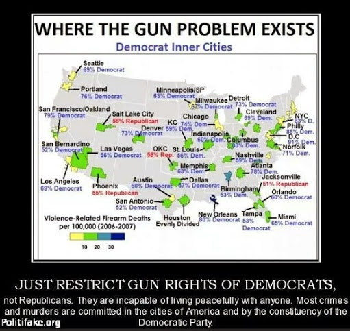
First, the American firearm-deathrate according to this table is 10.1 per 100,000 people, but the yellow swatches in the Infographic are, according to the legend, areas that have less than that rate. Conversely, the entire states of Lousiana, Alabama, Mississippi, Wyoming, Montana... well, actually, 30 entire states ... should be colored in green (indicating above-average deathrates). Alaska, which has a statewide deathrate of 20.4 per 100,000, should be in pale blue.
The infographic may still be true, since it may be that the areas in the infographic are very violent places in an otherwise tranquil sea of peace and love, but the lowest-deathrate states (including the NY/NJ/CT tristate area and Massachusetts, despite the graphics highlighting them) are considered liberal / Democratic. So it doesn't seem all Democrats "are incapable of living peacefully with anyone".
Perhaps the creator of the Infographic was trying to create an argument, not so much about political affiliation, but some other characteristic. I wonder what characteristic a person spewing agitprop about "Democrat inner cities" could mean?

