Is there an unusual distribution of adverse events by lot number for the mRNA COVID-19 vaccines?
The data cannot support this nor other claims made in the article.
No conclusions about actual harm can be made from the VAERS data alone.
What is VAERS?
The article consistently conflates unverified reports of harm with actual harm. For example.
This data alone shows that there have been 118 times as many adverse reactions, 174 times as many deaths, and 140 times as many hospitalisations due to the Moderna Covid-19 jab than there have been due to all other influenza vaccines combined.
"This data" show there have been unverified reports of adverse reactions. "This data" is VAERS, the Vaccine Adverse Event Reporting System run by the CDC. Misrepresenting VAERS is a favorite of anti-vaxxers.
VAERS is a data collection system for reports of harm which may be connected with a vaccine. Anyone can make a VAERS report. The intent of VAERS is to collect reports and follow up on them. It cannot be used alone to determine harm.
The CDC says this about VAERS
- VAERS reports are submitted by anyone and sometimes lack details or contain errors.
- VAERS data alone cannot determine if the vaccine caused the reported adverse event.
This specific limitation has caused confusion about the publicly available data, specifically regarding the number of reported deaths. In the past there have been instances where people misinterpreted reports of death following vaccination as death caused by the vaccines; that is a mistake.
VAERS accepts all reports of adverse events following vaccination without judging whether the vaccine caused the adverse health event. Some reports to VAERS might represent true vaccine reactions, and others might be coincidental adverse health events not related to vaccination at all.
Generally, a causal relationship cannot be established using information from VAERS reports alone.
- The number of reports submitted to VAERS may increase in response to media attention and increased public awareness.
- It is not possible to use VAERS data to calculate how often an adverse event occurs in a population.
VAERS can, at best, show anomalies in what is being reported as an adverse reaction to the COVID-19 vaccine. Given the charged nature of COVID-19 vaccination we would expect a lot of noise in the reports as people attribute any post-vaccination reaction to the vaccine.
The next step would be to verify these reports, the article makes no attempt to so.
Flu vaccines are a questionable control
The article uses VAERS reports about the flu vaccine as a control. And if VAERS represented actual deaths due to vaccination that might be fine. But VAERS represents unverified reports about deaths which could be attributed to vaccination.
Any differences in their VAERS reports could be because of variations in how people feel about the flu vaccines vs COVID-19 vaccines. Because of this variable, using VAERS reports about the flu as a control can only show differences in the VAERS reports. No conclusions about actual harm can be made from the VAERS data alone.
Their analysis of the data has flaws.
Putting that aside, does the article show there is an unusual distribution of adverse events in the VAERS reports? Let's look at problems with their analysis.
Lot sizes are not equal
The whole article is based on reports per lot and that makes the whole analysis moot.
For their analysis to be significant they need reports per dose. Otherwise differences in lot sizes could explain the variations. You'd expect a lot of 10,000 doses to have more reports than a lot of 100 doses.
They could get reports per dose by controlling for each lot's size.
They didn't, instead they just assume an average size and apply that.
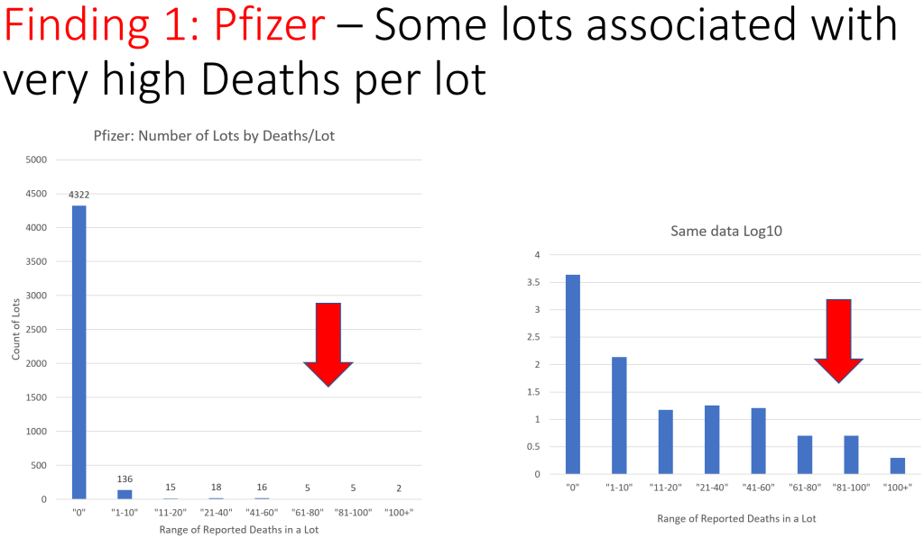
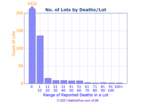
The above chart shows the number of adverse event reports made to VAERS against the Pfizer Covid-19 vaccine sorted by the lot number of vaccine that was administered prior to the adverse event. We do not have reliable information about standard lot size, but news articles indicate an average lot size of 1000 vials (approx. 6000 doses).
Without controlling for the size of each lot, no conclusions can be drawn. All their conclusions can be explained by different lot sizes.
Lot groups are not equally sized
When they group by lot number, it is unclear what size their groups are. Eyeballing one graph we see lot groups of 261203, 276532, 276544, 276560, 276571, 279734, 279796. The differences between lot numbers are 15329, 12, 16, 11, 3163, 62.
Are these the group sizes? Are there gaps in the lot numbers? If so, are the gaps real? No explanation is given.
Comparing different sized groups of different sized lots would certainly explain the variations.
Lot numbers are not random
They do, a few times, group by lot number and sort them alphabetically. This might be meaningful if lot numbers were random, but the article does not claim that.
Lot numbers are likely tied to several variables such as when, where, and who produced the vaccine. Grouping by lot number and alphabetizing is likely producing a jumble of these variables.
This can have the effect of making it look like what is really the effect of many variables look like it comes from the lot numbers.
<12 states vs 13-50 states: broad, asymmetrical, multi-variable
Similarly, the article splits the data into two groups.
- Lots which were distributed to 12 states or fewer.
- Lots which were distributed to 13 to 50 states.
And then finds more reports were in the 13-50 than in the 1-12 state group. Is this significant?
Why 12? Because 12 is the maximum number of states a single lot of their control flu vaccine was sent to. I'll have more to say on that control later, but they lack a control for the 13-50 set. Are the anomalies due to the vaccine? Or due to being shipped widely across the US? Without a control we can't say.
The sizes of the two sets vary wildly. In the Pfizer case the 1-12 group is 4,289 lots or 97% of the data, while the 13-50 group is just 130 or 3%. Large data sets dampen anomalies, small data sets amplify them.
However, the absolute numbers appear compelling. 99 death reports for the 1-12 group vs 2,799 death reports for the much smaller 13-50 group. The largest number of reports from a single lot is 114 which rules out any small group of very anomalous lots. If true, this is interesting. But can we conclude this is because of the 1-12 vs 13-50 distribution? No.
The problem is lumping all the lots into two broad groups has made a jumble of all the variables. For example, we can imagine that if you're distributing a lot to 13-50 states it has to travel further and longer; is it a proxy for distance and time in transit? Is it a proxy for how they're stored and transported? Why were the lots split? Is it because they were distributed to states with lower populations, lower population densities, and smaller hospitals? Is it a proxy for geographical location? Is it something to do with the lot splitting process?
What if early in the pandemic the lots were distributed widely across the US? Then they're just graphing reporting over time.
Distributing to 13 states vs 50 states is a huge geographical distance that's been lumped together. What happens if you group in finer increments? 50 states includes Hawaii and Alaska, non-contiguous parts of the US requiring transport by ship or plane; what happens if you separate them?
If there was, for example, one state which usually got split lots and had anomalies in their VAERS system that single state could throw the whole 13-50 category off.
The 1-12 vs 13-50 data does bear some further investigation, but no conclusions can be drawn from that data long. With two broad and asymmetrical groups the individual variables must be teased apart. Instead of doing that investigation, the article instead stokes a conspiracy theory about distributing the safe vaccine to only certain states.
Low sample numbers
According to the charts, of 4519 lots...
- 96% (4322) reported no deaths.
- 3% (136) reported 1-10 deaths.
- 1% (61) reported more than 10 deaths.
The 96% case is no deaths reported. 99% is <= 10 deaths reported. The claim is about that 1%, just 61 lots. Conclusions about the 1% cannot be applied to the other 99%. All that can be concluded is there is something different about that 1%.
They are in such a low number of samples, no band with more than 10 deaths represents more than 15 lots, that we expect high variation.
The article does this elsewhere. In "Finding 2: Pfizer Lots sent to 13-50 states Have Unusually High AE Reports and Deaths" they compare 4289 lots distributed to 12 states with 130 lots distributed to more than 12. 97% of the lots compared to 3% of the lots. Again comparing a high number of lots with a low number of lots. We expect more variability in small samples.
Exaggerating small variations
The OP asks...
Are these huge variations between (reported events for) lots unusual or are there benign explanations?
These are not huge variations, they're only made to look that way. The article exaggerates small sample sizes and small variations through various tricks.
The article cherry picks anomalous data by in most cases discarding the 96 to 99% of data which has no or very few reported deaths and focusing in on the remaining 1 to 4% and using that to draw conclusions about the whole complete data set, or making them seem of equivalent size to the whole data set.
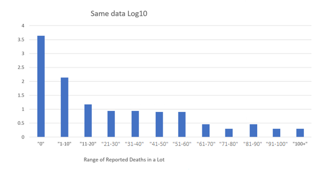
The article uses logarithmic charts. These artificially exaggerate small variations and dampen large ones. In the OP's logarithmic chart 1% of the data (11-20 and to the right) looks equivalent to 96% of the data (the 0 bar).
The remaining sample sizes are limited to about 100 or sometimes much less. When split up into groups, those groups can contain as few as 5 lots. When the numbers are that low, a variation of a single lot is as 20% difference.
Weather Vane covered one trick; the "Range of reported bands by lot" are not of equal width, some cover 10, some cover 20. This has the effect of grouping small numbers together making some groups look larger than they are.
They grouped the anomalies together and found they are anomalous.
The headline of the article is:
100% of Covid-19 Vaccine Deaths were caused by just 5% of the batches produced according to official Government data.
To support this claim they show lots of charts where they group the lots by number of reported deaths. They grouped the lots by reported deaths and found the lots are grouped by reported deaths. This is a tautology. It's like being concerned that 50% of people are below average.
What the data in the article does show is that 96% of lots had no reported deaths, 99% of lots had 10 or fewer reported deaths, and only 1% of lots had more. That seems fine.
In other places they find individual lot numbers which are "the most harmful" (has the most reports). This is expected when they are looking for the lot which has the most reports.
To discover a concerning anomaly one would have to group by a variable which should be independent. For example, the last digit of the lot number, or the day of week or time of day or month the lot was produced, or the facility which produced the lot. These groupings should be independent of the number of deaths.
If they found otherwise, that would be of concern. But only of concern, it wouldn't prove anything because they're using the wrong data.
Conclusion
We can conclude with the article's conclusion.
But the investigation of VAERS has also identified the specific batches of Pfizer and Moderna vaccine that have caused the most harm across the USA, which leads to other extremely serious questions requiring urgent answers.
- If you go looking for anomalies, you will find them. They fail to show they are significant.
- VAERS cannot be used to determine actual harm.
- At best this requires further investigation of the VAERS data by the author of the article to rule out other variables.
Why is it that certain batches of the vaccine have proven to be more harmful than others?
- Because the article grouped the batches like that.
Why is it that certain batches of Covid-19 vaccine have proven to be deadlier than others?
- Since this is all based on unverified reports, nothing in the article shows actual deaths.
- With such a large, unverified data set across a large population with such a charged topic, we'd expect such variations in reports.
- The variations represent 1%-3% of the data.
Why is it that the most harmful and deadly Covid-19 vaccines were distributed across the entire USA [13 or more states], whilst the least harmful and deadly were only ever distributed to a few states [12 or fewer]? Was this done on purpose?
- Since this is all based on unverified reports, nothing in the article shows actual harm nor deaths.
- The 13 or more set represents 3% of the data.
- The two sets may be a proxy for any number of other variables such as geographical location, political leanings, time during the pandemic, method of transport, age of the vaccine, method of storage, etc.
A Pfizer whistleblower from a Kansas manufacturing facility did after all reveal that “People are being made to sign off on things that normally they wouldn’t, and then they wonder why their own employees won’t take it”.
- Out of context non sequitur.


