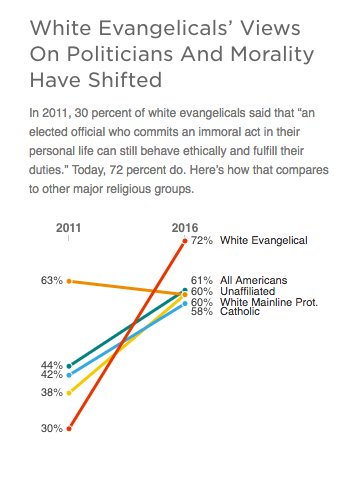
A colleague shared the below graphic from Twitter with claims about how the opinions of various demographic groups hava changed between 2011 and 2016:
This seems automatically dubious as neither the graphic nor the associated tweet cites any source for the data. Also pretty much all of the claimed percentages strike me as too high to be realistic, regardless of who or how immoral the president at the time of the survey happened to be.
Is this claim completely made up, or is it reporting an actual survey result (and if it is, is it doing so accurately)?

