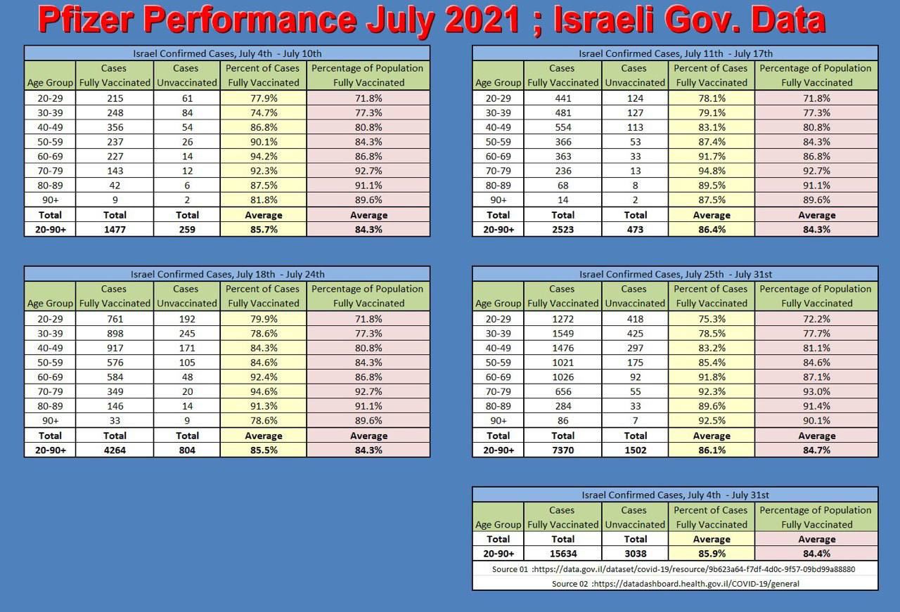
Yes, but observe that the data in the image includes only "cases" with no discrimination for their severity. (I'm saying this because Ivory Hecker was once a Fox 26 reporter, supposedly dismissed for her bias/promotion of hydroxychloroquine [and of Stella Immanuel], among other things.)
The low/waning efficacy of the Pfizer vaccine purely in terms of cases in Israel has been covered the mainstream press as well, e.g. CNBC on July 23.
Pfizer and BioNTech’s Covid-19 vaccine is just 39% effective in Israel where the delta variant is the dominant strain, according to a new report from the country’s Health Ministry.
The two-dose vaccine still works very well in preventing people from getting seriously sick, demonstrating 88% effectiveness against hospitalization and 91% effectiveness against severe illness, according to the Israeli data.
100% of the fully sequenced cases in Israel have been the delta variant in the past month [July]. Also, at the end of July, Israel has announced [3rd] booster shots for people over 60 y.o. who had their last vaccine dose 5 months before. The 5-month cutoff appears to have been inspired by a recent Israeli study relating time since last dose to the risk of infection:
There was a significantly higher rate of positive results among patients who received their second vaccine dose at least 146 days before the RT-PCR test compared to patients who have received their vaccine less than 146 days before: odds ratio for infection was 3.00 for patients aged over 60 (95% CI 1.86-5.11); 2.29 for patients aged between 40 and 59 (95% CI 1.67-3.17); and 1.74 for patients aged between 18 and 39 (95% CI 1.27-2.37); P<0.001 in each age group.
Preliminary data from a US study [preprint] (covered by the press today/yesterday), paints a somewhat similar picture.
Both
vaccines [Pfizer=BNT162b2; Moderna=mRNA-1273] were highly effective during this study period against SARS-CoV-2 infection
(mRNA-1273: 86%, 95%CI: 81-90.6%; BNT162b2: 76%, 95%CI: 69-81%) and COVID-19
associated hospitalization (mRNA-1273: 91.6%, 95% CI: 81-97%; BNT162b2: 85%, 95% CI:
73-93%). However, in July, the effectiveness against infection was considerably lower for
mRNA-1273 (76%, 95% CI: 58-87%) with an even more pronounced reduction in
effectiveness for BNT162b2 (42%, 95% CI: 13-62%).
(More newsworthy was the fact that this latter study suggests Moderna offered substantially more protection than Pfizer against mere infection, in multiple US states. The lead investigator was also quoted by the press as suggesting only Moderna booster shots be considered...)
Now about the strict validity of the data in the image you've posted... The first link provided only has the raw numbers for the cases with and without vaccination, e.g. for the last week it looks like

They do match the uncolored columns in the infographic. However, the colored "conclusion" column data isn't found at that precise link given as source/reference. The yellow column from the infographic is easy to reproduce as positive_above_20_days_after_2nd_dose / (positive_above_20_days_after_2nd_dose + Sum_positive_without_vaccination). The weekly sums across age groups are trivially verified as correct as well. But I'm not sure whey they sourced the pink column from, which is the basis for [their] comparison(s). The raw data for the number persons vaccinated in each age group is given at another link in the same database, but this link is not cited in the infographic; however (a) this is not cumulative per time period so a fair bit of summing is need to get some cumulative totals and (b) there are no population totals for each group, so you can't derive the percentage of vaccinated just from there even after you sum.
However, even assuming their pink column is correctly sourced from somewhere else, the reason for your confusion and comment below this answer is probably that you're unware how the vaccine effectiveness is normally computed, which isn't by comparing those percentages as in that infographic. Instead you need the raw numbers of vaccinated, unvaccinated, and cases among each of these (4 raw numbers) to compute effectives. So the percentages in those colored columns don't match any official data because they compute something else.
As for the yellow column, it's actually not very useful in itself, as explained here (by an expert):
This is the wrong metric to look at," she wrote in a blog post, explaining that it excludes the wider population and, therefore, represents the "probability of being vaccinated given you are sick" rather than "the probability of being sick given you are vaccinated.
There's a more sophisticated example used to illustrate the pitfall at that last link, but simply in the limit case where everyone is vaccinated, the yellow column reaches 100% (as all the cases are by necessity among the vaccinated) so it conveys no useful information about how good (or bad) the vaccine is.


