Yes. (every metric I've looked at says that the distribution has become more skewed; whether it is "much" more skewed depends on which metric you look at, and how big you consider "much" to be ...)
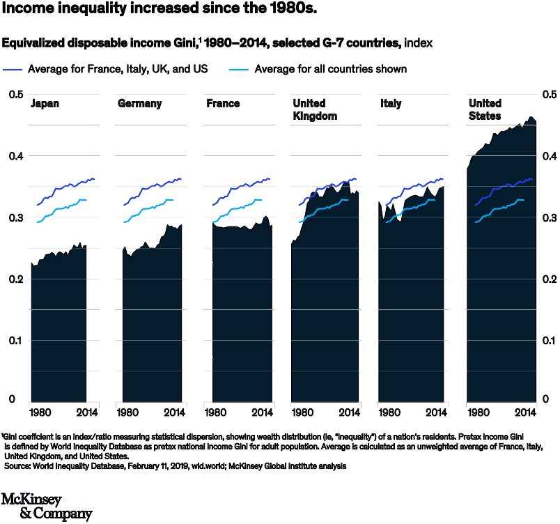
This figure from a 2019 McKinsey study shows trends in the Gini coefficient over almost four decades (1980-2014), supporting the claim that income inequality has increased dramatically in the US (roughly in parallel with changes in other G7 countries, although France is much flatter and the UK had a really dramatic increase in the 1980s). The disadvantage of the Gini coefficient is that it's a different metric from the bottom 99%/top 1% quantity that Andersen uses (so it could be telling a different story, although that seems unlikely); the advantage is that it measures inequality across the whole spectrum of incomes, so that it's harder to cherry-pick cutoffs (90/10, 99/1, 99.9/0.1, etc.) that support a particular story. (This figure also measures "equivalized [whatever that is] disposable income" (emphasis added), so that could presumably also change conclusions; overall, though, it seems to support the conclusion.)

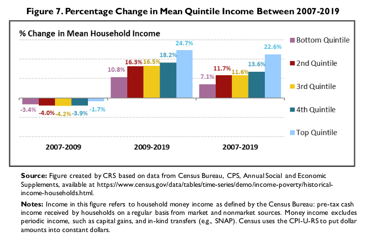
Another view, from the Congressional Research Service report The U.S. Income Distribution: Trends and Issues: this is over a slightly different time period and shows two different ways to break down income growth rate distribution:
- at the level of quintiles, from 2009 on there was progressively faster income growth in higher quintiles. The biggest jump is between the second quintile (60th-80th percentile) and the top quintile (>80).

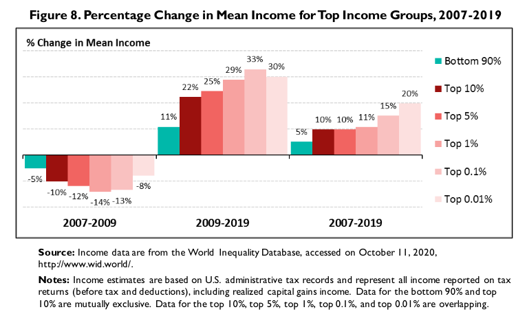
Or, we can compare growth rates in progressively smaller slices of the top end of the distribution (bottom 90%/top 10%, 5%, 1%, 0.1%, 0.01%). Here growth rates also skew higher in higher income slices (although top 0.1% is greater than top 0.01% for 2009-2019).

I think all of this data broadly supports the claim. You could certainly make an argument that: "the most relevant comparison is (2d and 3d quintile) vs 4th quintile, and the growth rate difference between those categories is only 2%, which isn't very much", but at that point we would be having a "how-long-is-a-piece-of-string" (and "which-bit-of-the-string-is-the-best-part-to-measure") argument ...
If anyone wants to do the work to get the numbers that compare (say) the 20th-80th percentile with the 80th-90th percentile (to remove the top decline that @blankip feels is driving the whole pattern), I'd be curious ...
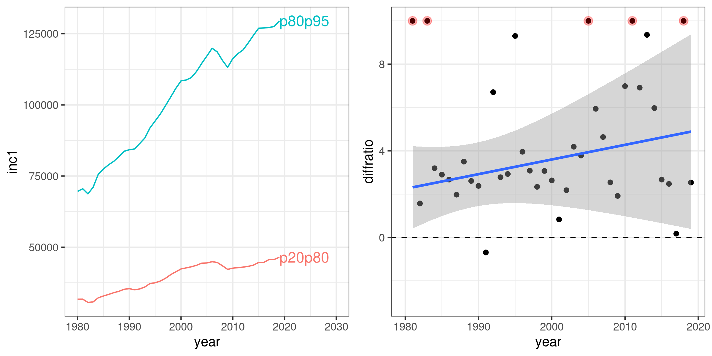
OK, here it is, data from https://wid.world/data/ : the lefthand plot is the mean incomes of the 20th-80th percentile and 80th-95th percentile, 1980-2019 (inflation-adjusted, I think to 2019 dollars). The righthand plot shows the year-by-year ratio of the change in income; the points in red are outliers >10 (up to a ratio of 51.2 for 1981 ...) which were squashed for display purposes. The line is a robust linear model (best-fit straight line, downweighting extreme points). Conclusion: top (80-95) US incomes were growing 2 to 5 times faster (in inflation-adjusted dollars) than middle (20-80) incomes.
Put another way, the middle incomes increased by 47% over this time period, the top incomes increased by 86%.

data here (I'm not sure of the difference between "inc1" and "inc2", one is labeled "equal split" and the other is "individual". This is "Pre-tax national income, average income or wealth, adults, ..., constant local")

