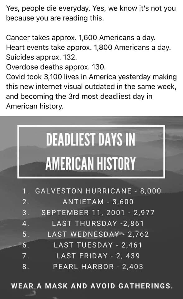
For what's worth it, the author of the meme was interviewed by CNET, which quoted & paraphraphrased these bits about how the listicle was created:
"The stark differences between American society's reaction to Pearl Harbor, 9/11 and this pandemic hit me so strongly," she said, also giving credit to a similar graphic she saw. She used the best available estimates for the various historical death tolls, and pulled the numbers of COVID-19 deaths from the US Centers for Disease Control and Prevention's COVID Data Tracker. [...]
Some have criticized the graphic for not including daily deaths from other illnesses, for leaving off other major events, or for other reasons. Carey has heard the criticism but still sees the importance of the information. [...]
She has updated the graphic several times since the first version, which included eight deadly days. She'd like to add numbers from the 1918 Spanish flu if she can find accurate sources. But the point remains the same.
"I may update the graphic or make an additional one as the death toll from COVID climbs, and I hate that we know it will," she said. "Will today be the day we lose more people in one day than we did on 9/11? We never should have had to ask that question."
So, if you want to be kind/charitable (rather than slam her for motivated reasoning), call it a work in progress as far as the more absolute claims like "3d most deadliest day" are concerned.
Politifact checked an 8-spot version of same meme, but for a slightly different claim (instead of 3rd deadliest, the old claim was 4 out of 8 most deadly days), and called it "half-true":
The graphic shows that four of the eight deadliest days since the country’s founding took place between Dec. 2 and Dec. 7, 2020. The image places daily COVID-19 deaths from those days alongside death tolls from the Galveston Hurricane, the battle of Antietam, Pearl Harbor and the 9/11 terrorist attacks. [...]
Most of the figures cited are accurate and the general thrust of the claim is valid: The pandemic has produced staggeringly high daily death counts that reached 3,411 on Dec. 9 — a high that came after the image was created.
However, the post contains some problems: It does not take into account daily deaths not linked to a specific cause, and it omits some historical events that resulted in greater numbers of fatalities.
Although the image purports to be a list of the "deadliest days in American history," it only lists fatalities related to specific mass-fatality events. It leaves out the number of deaths from all causes.
For example, the list cites Dec. 4, 2020, as having a death toll of 2,861.
It’s true that 2,861 people were reported on that day to have died of COVID-19, according to the CDC’s Data Tracker. This number doesn’t include any of the people who died from causes besides COVID-19, such as murder, heart attacks or cancer.
In 2017, an average of 7,708 deaths occurred each day, according to the Centers for Disease Control and Prevention.
Other historical events omitted from the chart
The list doesn’t provide an accurate list of the top eight deadliest days in American history.
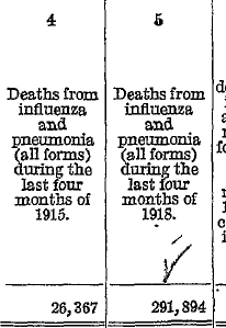
Perhaps the most notable omission from the list is also the most directly analogous to the COVID-19 pandemic. The 1918 flu pandemic savaged the United States between Sept. 1 and Dec. 31, 1918, killing an estimated 381,019 people in those four months alone. That’s an average of around 3,123 people per day.
[...]
Liz Skilton, an associate professor of history at the University of Louisiana at Lafayette, who specializes in natural disasters, disapproved of the way the image compared different types of disastrous events by placing them side by side.
"Different types of disasters rarely ever can be compared directly as there are different sets of hazards and reactions to these hazards that influence the outcome of events," she said. "This is not to say disasters cannot be compared at all, it just means that making direct comparisons between them in an oversimplified way is damaging to our understanding of their impact and could even harm our ability to react to these incidents appropriately."
[...]
Our ruling
A viral image claims that the COVID-19 pandemic has caused 4 of the 8 "deadliest days in American history."
The image omits some historical events and only lists fatalities linked to specific causes.
However, the broad claim of the image is accurate: the COVID-19 pandemic has seen daily death totals that have surpassed those of events memorialized as national tragedies, including Pearl Harbor and 9/11.
We rate this image Half True.
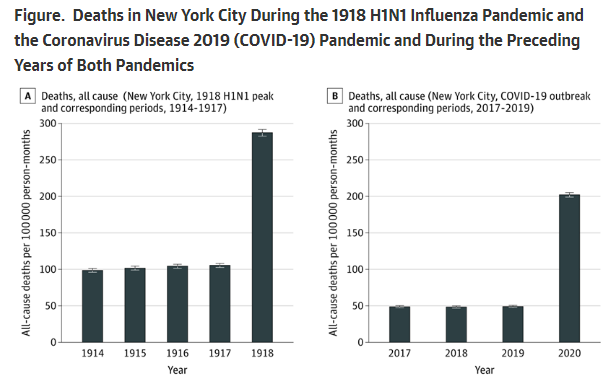
As a bit of an aside, but hopefully insightful/related enough, on Covid-19 vs 1918 influenza, there's an August 2020 article in a JAMA journal that more scientifically compared the two (including relative to population), but only for NYC, and only for the first two months of the Covid-19 outbreak (which were the peak/worst till then):
During the peak of the 1918 H1N1 influenza outbreak in New York City, a total of 31,589 all-cause deaths occurred among 5,500,000 residents, yielding an incident rate of 287.17 deaths per 100,000 person-months (95% CI, 282.71-291.69 deaths per 100,000 person-months) (Figure A) The incident rate ratio for all-cause mortality during the H1N1 influenza pandemic compared with corresponding periods from 1914 to 1917 was 2.80 (95% CI, 2.74-2.86). During the early period of the COVID-19 outbreak in New York City, 33,465 all-cause deaths occurred among 8,280,000 residents, yielding an incident rate of 202.08 deaths per 100,000 person-months (95% CI, 199.03-205.17 deaths per 100,000 person-months). (Figure B) The incident rate ratio for all-cause mortality during the study period of 2020 compared with corresponding periods from 2017 through 2019 was 4.15 (95% CI, 4.05-4.24). The incident rate ratio for all-cause mortality during the peak of the 1918 H1N1 influenza pandemic and the early 2020 COVID-19 outbreak was 0.70 (95% CI, 0.69-0.72).

This cohort study found that the absolute increase in deaths over baseline (ie, excess mortality) observed during the peak of 1918 H1N1 influenza pandemic was higher than but comparable to that observed during the first 2 months of the COVID-19 outbreak in New York City.
However, because baseline mortality rates from 2017 to 2019 were less than half that observed from 1914 to 1917 (owing to improvements in hygiene and modern achievements in medicine, public health, and safety), the relative increase during early COVID-19 period was substantially greater than during the peak of the 1918 H1N1 influenza pandemic. [...]
[Concluding:] mortality associated with COVID-19 during the early phase of the New York City outbreak was comparable to the peak mortality observed during the 1918 H1N1 influenza pandemic
In response to a comment the authors made the periods compared more explicit:
we compared the incident rates for all-cause deaths in the first 61 days in which deaths occurred in New York City in 2020 due to COVID-19 to the 61 days of October and November of 1918
So if focusing (or cherry picking) only this badly hit US city for that worst time frame, the comparison isn't too far fetched even with the influenza of 1918, i.e. you could say Covid-19 reached 70% of the severity of the 1918 H1N1 excess mortality when considering that relative ratio of peaks. But there's also the aspect that relative to years before each pandemic Covid-19 was a worse percentage/ratio-wise increase in that peak compared to 1918, i.e. 4.15 vs 2.8.
One of the comments on the article (from an MD) said however that in 1918 NYC had reported below-average excess deaths compared to other US cities, so in that sense the comparison can be misleading as it underestimates the nationwide peak(s) in urban areas for the 1918 influenza. (The veracity of this comment can be verified e.g. with another paper: "During the pandemic, New York City's excess death rate per 1,000 was reportedly 4.7, compared with 6.5 in Boston and 7.3 in Philadelphia.")


