I'd like to tackle a few sets of claims/arguments Wodarg makes in the two videos:
- (Unknown) baseline prevalence of corona virus infections.
- Excess mortality / "we wouldn't see anything special"
- Comparison with Swine Flu when Wodarg was public health officer
(Unknown) baseline prevalence of CoV
The Glasgow paper he refers to did not look at the general population but at patients showing up in medical practices. They were monitoring 3 particular coronaviruses.
The 7–15% coronaviruses are presented in an ambiguous way: this is not the prevalence of coronaviruses among the patient population but the relative prevalence, i.e. among those samples where viruses were found. The prevalence among the patient population is only about 1/4 of that since only in ≈ 1/4 of the samples one or more of the monitored viruses were found. So those 3 coronaviruses had a prevalence of ≈ 2–4% among the population that showed up at a medical practice with acute respiratory disease.
Update Mar 20 This review on the common cold does cite 3 studies saying 10–15% are caused by coronaviruses, though. Looks as if the claim may be true after all, but the data he showed did not support the claim.
He claims that during "flu season" we monitor influenza viruses, but not others. That is only partially correct, as e.g. in Germany the RKI monitors viruses from 5 groups (including influenza and rhinoviruses). Among them were no corona viruses until they started with SARS-CoV-2 in week 8 this year.
Website at RKI about monitoring of the flu
current (11th week) weekly report
In week 11, they had one sample that was positive for SARS-CoV-2 and also for Influenza.
Wodarg is right when he says that this year, we have a very mild flu season.
Wodarg makes an argument that one would expect increasing prevalence for 'coronaviruses in general population' < 'people who show up in medical practice' < 'people who are in the hospital'.
While this may be true, it also has the implied assumption that: either are coronaviruses associated with severe disease (i.e. existing disease helps coronavirus) or coronaviruses are in fact to be taken seriously in the sense that they can make people so sick that they have to go to the hospital.
Excess mortality / "we wouldn't see anything special"
Wodarg refers to euromomo as a service where we can see whether there's excess mortality, e.g. due to acute respiratory illness. He argues that if we weren't monitoring SARS-CoV-2 now, no-one would realize that there is something unusual (and in the second video, the reporter asks "If we wouldn't test, this would not catch anyones eye?" and he confirms "No, we wouldn't realize it.").
Testing bias can distort not only the public uptake of a situation but also statistics, see e.g. lead time bias.
But with COVID-19, the direction was the other way round: an outbreak of severe pneumonia happened (so people did notice without testing for the virus), and the cause was not known. Now, Wodarg argues that Wuhan is an important virological center in China. Under these circumstances, unknown cause translates to: it wasn't any of the usual suspects (viruses, bacteria, substances). Then people began to search, and found the virus. And we still see severe pneumonia with outbreaks of this virus, see Italy.
I don't think this is the case, though. It is just that SARS-CoV-2 deaths lag behind positive tests.
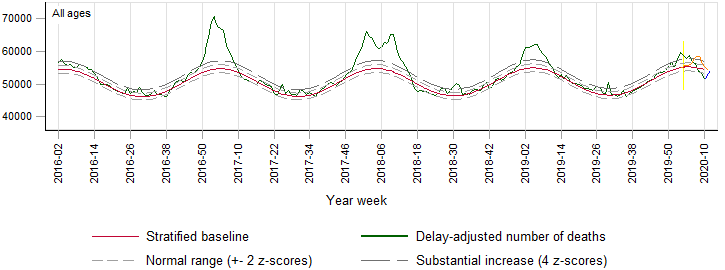
I'd have preferred to work with seasonal mortality data for Italy and Hubei, but I didn't find any, so I use the European data at euromomo.
- today (Mar 18th) the latest euromomo data is from week 10, i.e. until March 8th, 1.5 weeks ago. In terms SARS-CoV-2 in Europe, in Italy the number of positively tested cases have since increased by a factor of 4.8, in Germany by a factor of almost 11. (numbers from worldometers).

I took the liberty to
add SARS-CoV-2 positive deaths from Italy in blue: in week 10, 325 SARS-CoV-2 positive patients in Italy died. That's just a bit more than half a pixel in the graph (and a bit fewer than the average weekly traffic deaths in Italy according to the EU traffic death statistic). In week 11, the increase should start to be visible.
As Wodarg says, this year's flu season was very mild, and the graph shows fewer deaths than usual in this season. (However, we may have to be a bit cautious with this as some other graphs on the web page indicate that numbers may not be complete yet)
project the Hubei deaths in orange into the euromomo graph as follows: Hubei has 57 mio inhabitants, euromomo monitors 368 mio. (inhabitant numbers from wikipedia), that is a factor of ≈ 6.4. I counted the deaths using worldometers and the COVID-19 daily deaths by region diagram on Wikipedia, multiplied them by 368/57 to "simulate" the same kind of infection intensity as in Hubei for Europe and drew them on top of the red seasonal average. This "bump" sticks out of the +4z line for substantial excess mortality.
The yellow line is when the quarantine in Wuhan/Hubei started.
So the mortality bump of the same epidemic as in Hubei happening throughout Europe would have made a noticeable bump (at least unless the epidemic reduces mortality from other causes, such as reduced traffic mortality in quarantine situations), even though it is somewhat smaller than this year's mild flu season. Note though that the death bump is completely behind the quarantine start date – the mode is about 3 weeks later. But this is with severe restrictions. The argument that nothing special is happening and no particular measures are needed is on rather shaky ground.
We know that SARS-CoV-2 has an incubation period of about 5 (1 - 14) days during which it is also already contagious. Median time from onset of symptoms to death was found to be 2 weeks (6 - 41 days).
Mortality data will thus lag about 3 weeks after infection.
In the last 3 weeks, the SARS-CoV-2 positive cases went up by a factor of 100 in Italy, x520 in Germany, and x120 in the US. Note that testing is performed in a population that is at high risk of having contracted SARS-CoV-2. Note that is argumentation doesn't even include any time between death until it appears in the official statistics. If public health officers don't have faster access to the mortality data, using euromomo would mean another 1 1/2 week's delay (3 days for the weekly flu report of RKI).
Excess mortality is an important instrument, but it is delayed and therefore IMHO too slow for diseases with the epidemiological characteristics we face here.
Wodarg argues that a typical heavy flu season in Germany causes maybe 20000 deaths, and due to the prevalence of coronaviruses (see above) somewhere around 2000–3000 coronavirus deaths in a season would be normal – which is far more than what we see with SARS-CoV-2.
As I explained above, the paper actually found prevalences that are only a quarter of what Wodarg claims, so the "threshold death toll" should rather be 500–750 deaths. See update above.
Which again, we don't have in Germany.
The situation in Italy looks different, though (Wodarg evades answers when the reporter asks about Italy, and what he says is self-contradictory): While Italy has a smaller population than Germany, their annual excess mortality in the flu season is estimated to be in the same magnitude – which, like the SARS-CoV-2 mortality now is attributed to the large proportion of old people.
Worldometer right now (Mar 20th) reports >4000 SARS-CoV-2 positive deaths in Italy so far (and there is no indication that this is over in Italy).
Comparison with Swine Flu when Wodarg was public health officer
Wodarg compares the situation with the pig flu and avian flu when he was working as public health officer where "nothing happened".
- IMHO he is right when he says that the decisions to curb rights and shut down economy must be taken very seriously and that panic hampers good decision taking.
I also agree with him that a positive-feedback loop in media reporting may increase panic and hinder rational decisions.
He mentions that the definition of pandemic changed from a disease that causes severe illness spreading over the whole world to a disease spreading over the whole world.
However, that point is moot here: SARS-CoV-2 causes Severe Acute Respiratory Syndrome (severe pneumonia) so the more restrictive definitions would apply as well.
Also the comparison with the flu decisions he faced as public health officer is IMHO not quite as easy as he makes it out:
Influenza has a much shorter incubation period of about 2 (1–4) days. This means for the public health decision perspective, that dark count of cases in incubation period is much less of a problem for influenza than for SARS-CoV-2. This does make a huge difference for public health decisions.
Also the duration after onset of symptoms is shorter: usually 1 week for the flu, but 2+ weeks for COVID-19. Again, a longer sick period means a heavier burden to the health system: if we have a capacity to care about n people in hospital, with an average stay of 3 weeks, only n/3 cases per week can be taken care of. With 2 weeks in hospital, that's n/2 per week or 50% more.
I didn't find statistics on time between onset of symptoms and death for influenza, so I can not comment whether reported mortality rates are better suitable for reacting to flu epidemics due to flu patients dying fast.
Update (Mar 19th): I checked euromomo again since it said yesterday that the weekly updates are Thursday around noon. Week 11 also shows considerably lower mortality than expected, but they have a notice about COVID-19 now, including:
[…] there is always a few weeks of delay in death registration and reporting. Hence, the EuroMOMO mortality figures for the most recent weeks must be interpreted with caution. Therefore, although no increased mortality is currently observed in the EuroMOMO figures, it does not rule out that increased mortality occur in some areas or in some age groups, including mortality related to COVID-19.
The per-country graphs are unfortunately barely readable, but as the color changes where they try to correct for delay in reporting of deaths, we can see that actually death notifications from Italy are incomplete for the last 6 weeks or so.
What is correction for delay in reporting? Countries have varying deadlines to report/register deaths at the local inhabitant register, these registers may report only so often to the province register -> country -> euromomo). So this may take a while, and unless the deadlines are synchronized (which AFAIK they aren't), this means that death numbers may "trickle in" at euromomo over a number of weeks. Until this is all done, the reported number of deaths will be too low for the last n weeks. If n isn't negligible, we'd expect the last data points to almost always show fewer deaths than normal. However, over time, euromomo can gain experience what percentage of deaths for a particular country are usually reported to them within how many weeks. That allows to apply a preliminary correction under the assumption that the reporting is as usual (which I doubt at the moment e.g. for Italy). For the question here however, the actual correction is not so important since the absolute numbers do not indicate such a correction, and I used this only as an indicator how long it may take until the final curve is available.
Update Mar 20: The Wodarg videos meanwhile made it into mainstream media in Germany. Tagesschau Spiegel Zeit/dpa merkur (Bild cites Wodargs without any comments)
(While I don't find all the lines of argumentation compelling, I think they are worth reading.)
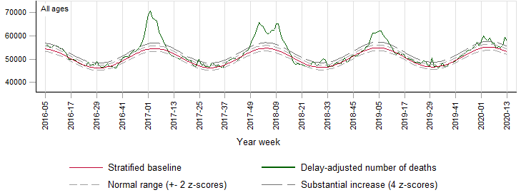
Update Apr 2: Euromomo data for week 13 is out:

the low after the flu season doesn't go below the expected seasonal average any more. The final downtrend we saw before was thus an indication of reporting delay.
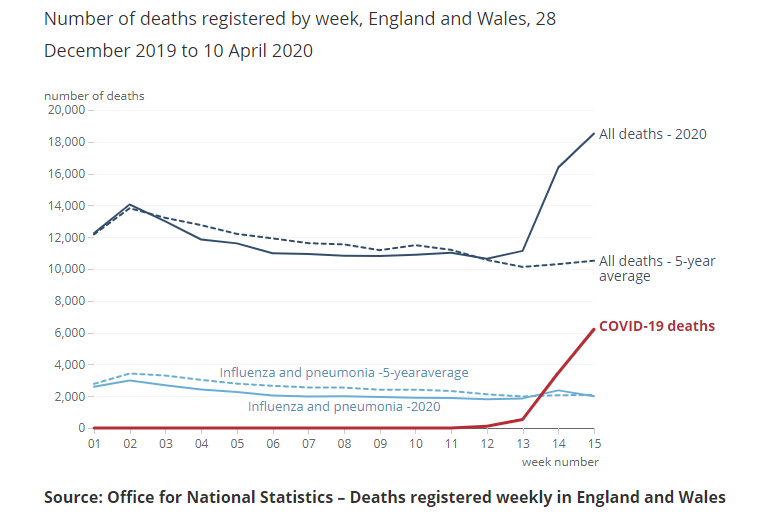
We now see that in week 12 + 13 the overal mortality across all ages and all participating countries has been very unusually high, approximately +8z from the seasonal average.
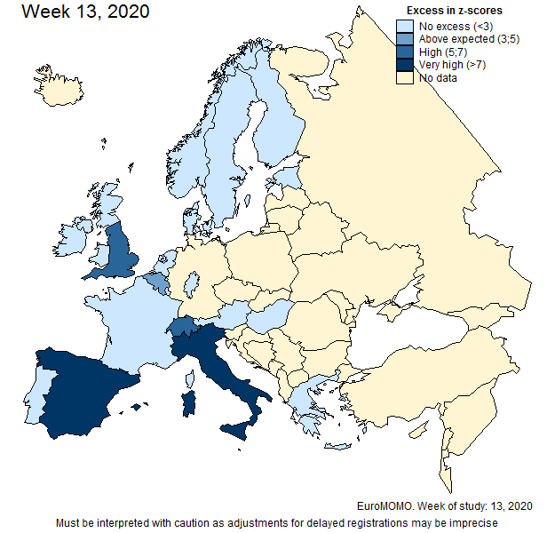
A closer inspection of the per-country deviation from the seasonal average shows that e.g. for Italy this peak has a size now like the flu season early 2017 (which, however, went away without lockdown).
The excess mortality maps now show high mortality for Italy in week 11 (and very high for week 12 + 13), Spain has also very high excess mortality for week 12 + 13 (Belgium, France, England have also shown up in week 12 or 13).

