51

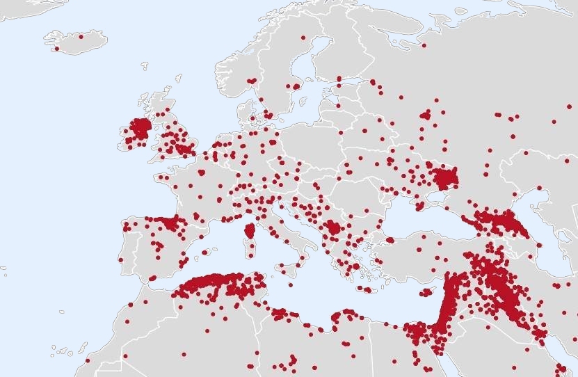
Recently this map of terrorist attacks in Europe went viral and was reposted many times in social media. Does it present actual data about terrorist attacks?

Map of terrorist attacks

Background: The map gained popularity because of ongoing discussion about immigrants. Poland firmly opposes immigration from Muslim countries (North Africa, Middle East) and obligatory limits of immigrants European Commission want to impose. This country is also a big gap on this map. Some nationalists claim that there is no terrorism in Poland, because of their immigration policy.

Examples of usage:

20
  • 46
    The vast majority of those dots are in Asia/Africa. The dots seem to cluster in areas where there is well established conflict going on (Israel, Iraq, Syria, North Caucasus, Eastern Ukraine.) Since it isn't dated I have a feeling someone is including the Troubles and making Northern Ireland look much worse than it might otherwise be. Also, I can't find any references at all to actual terrorist attacks in Iceland, so they may using a VERY broad definition of "terrorist attacks".
    – DenisS
    Commented May 31, 2017 at 17:01
  • 12
    Also, as far as I can tell, Poland has no Muslim immigration ban.
    – DenisS
    Commented May 31, 2017 at 17:05
  • 17
    -1 Because this is clearly not about a map, but about the implied claim. Any answer would need to take that into considerations. Still, it makes it unclear what is actually being asked, which will attract bad answers, which makes it a bad question in my opinion. To make this a good question, it should instead directly ask about the topic the OP is interested in (if it's not a duplicate and generally on-topic here, and if there are sources to show notability; otherwise, politics.SE may be a better fit).
    – tim
    Commented May 31, 2017 at 18:24
  • 11
    The map may well be true, but than the time-scale has to be several decades. Lots of dots in Northern Ireland (and London). Those are no Muslim terrorist attacks, I don't think Ireland had any of those. Same goes for the Basque region.
    – DocM
    Commented May 31, 2017 at 19:15
  • 16
    The map definitely takes liberties with the definition of terrorism. For example the Tuusula shooting (Finland) had no ideological motivation, similar to what I believe is referred to in the USA as an 'active shooter event'.
    – Nobilis
    Commented Jun 1, 2017 at 8:23

3 Answers 3

100

tl;dr: The map is likely correct and based on the GTD from 2001 to 2014. As the map is not about Islamic terrorist attacks, but all terrorist attacks, no conclusion about Islamic attacks or refugees can be drawn from it.

Source of the Map

It is very likely that this map uses the Global Terrorism Database as a source, likely from 2001 to 2014, and there is no reason to doubt its accuracy.

The two dots in Iceland are the two terrorist attacks in Akureyri and Reykjavik in 2012 and 2014.

The dot in Portugal represents a terrorist attack in Lisbon in 2011. Note that this was not an Islamic attack, but an Anarchist attack.

We can assume that the map shows attacks after 2001, because before then, there are recorded terrorist attacks in Poland. This is the earliest occurance of the map that I could find, which mentions 2001.

We can also assume that the map is from before 2015, as the high number of attacks in Finland are not included.

A similar map can be seen here which visualizes the GTD data from 2011 to 2014.

The GTD also provides their own map, but it's for a 40 year span. Still, it shows a similar tendency as the map from the OP.

Quality of the map

Note that the map from the OP displays attacks as dots, which is a poor representation for what the map wants to express.

In countries in which terrorist attacks are concentrated on a specific location, it makes it appear as if there was less terrorism than there actually was, and for countries were terrorist attacks are spread out, it leads to the opposite effect.

The heatmap from the GTD linked above better visualizes the concentration of terrorist attacks.

About the GTD

Note that the definition of terrorism by the GTD does not just include major attacks or attacks with multiple fatalities. It also is not limited to a specific motivation (Islamic for example):

  • Criterion I: The act must be aimed at attaining a political, economic, religious, or social goal.
  • Criterion II: There must be evidence of an intention to coerce, intimidate, or convey some other message to a larger audience (or audiences) than the immediate victims.
  • Criterion III: The action must be outside the context of legitimate warfare activities.

Conclusions to draw from the map

We can't draw the conclusions proposed in the OP from this map for various reasons, among them:

  1. It is a map of all terrorist attacks, not just of terrorist attacks committed by refugees, and also not just Islamic attacks. This can easily be seen by the high amount of attacks in Ireland and Spain (specifically Basque Country), as well as the anarchist attack in Portugal. A considerable number of the attacks (even worldwide) in the GTD are non-Islamic.
  2. Even if we were to accept the map as showing attacks by refugees - which it does not - the map does not match the data of refugees by country (see also here; note the relatively high number of refugees in Sweden in 2014, and compare it to the very low number of refugees in Spain).
28
  • 4
    +1, I feel like a lot of these kind of images and data-sets tend to break the world into a pre- and post- 9/11 world when using the data. Also the Iceland finding seems to have confirmed what I suspected in my comment on the question. They are using a very broad definition of terrorist attacks to generate this data. I wonder what this image would look like if you excluded A) Terrorist attacks outside of Europe B) Terrorist attacks that did not have any fatalities and C) Terrorist attacks by non-Islamic organizations
    – DenisS
    Commented May 31, 2017 at 20:57
  • 29
    The number of attacks in Ireland doesn't match any recent timescale: it would need to go back to the 1970s for those dots to be credible. And terroriism in Ireland wasn't committed by immigrants but by natives so it doesn't exactly support the attached claim that immigration control stops terror (same is true for other concentrations, but Ireland is obvious for those who know history).
    – matt_black
    Commented May 31, 2017 at 23:38
  • 25
    Re. "the number of attacks in Ireland doesn't match any recent timescale." -- the GTD returns 140 incidents from 2001 to 2015 (most recent data). However, it seems relevant that of those, only 6 had injuries, only 1 had multiple injuries, and none caused a fatality. start.umd.edu/gtd/search/… Commented Jun 1, 2017 at 1:15
  • 33
    I find it interesting that maps like these are used as anti-immigration propaganda. I checked the Global Terrorism Database, and ALL the listed terrorist attacks in Finland from 2015 are by white native Finns who are trying to burn asylum seeker reception centers. Can't really be racist and use that map to show how bad asylum seekers are.
    – anon
    Commented Jun 1, 2017 at 10:36
  • 6
    @steinar that's kind of the point. The GTD uses a VERY open definition for "terrorist attack" than your average person. When you think of terrorist attack you think of 9/11 or the Manchester Bombing, not an attempt to burn a door to a church. Not that I fault the GTD for this as the site itself is very open about the details of a terrorist incident. Taking their data and aggregating it into a map which displays every terrorist incident as a dot is very deceptive.
    – DenisS
    Commented Jun 1, 2017 at 14:31
15

The claim that there are terrorist attacks all over the world but not in Poland is wrong.

The claim that the map presents a set of data, however incomplete, is correct.

The accepted answer explains where the data comes from, it's the recorded incidents after 9/11 from the GTD. But I think it's also necessary to explore the accuracy of the data.

There are 2 issues with the accuracy:

  1. The incidents are not what the typical reader of the map is likely to suspect. A majority of incidents involved deliberate property damage with no dead or injured, and the incidents are often committed by unknown assailants. I am not saying these events don't classify as terrorism. It primarily includes events such as:

  2. While there are no dots in Poland, similar events did indeed happen in Poland. This is the result of a brief search:

There are also some stories that debatably don't classify, yet demonstrate that Poland does have a similar level of terrorism as some other European countries:

In conclusion:

The data contains an incomplete set of events that can reasonably be classified as possibly terrorist in nature. Notably missing from the data are events in Poland, which the claim and the question is about.

1
  • Comments are not for extended discussion; this conversation has been moved to chat.
    – Sklivvz
    Commented Mar 23, 2018 at 21:25
0

No. The map seems to follow a vaguely correct pattern but there are obvious errors. For example hot spots like London are shown but when you look closer the attacks have the same density over the rural regions surrounding it.

Here is an alternative map from the university of Maryland. https://www.start.umd.edu/gtd/images/START_GlobalTerrorismDatabase_2015TerroristAttacksConcentrationIntensityMap.jpg Many spots allign which would imply that they cover the same period but there are spots that appear on the OP's map and not on MaryLands and vise versa.

Here is a discussion about what appears to be the world map in which the OP's map was taken. Including a discussion about individual points which are questioned. https://www.reddit.com/r/MapPorn/comments/3taz61/map_of_terrorist_incidents_since_911_37741893/

5
  • -1 Because the "obvious errors" aren't explained clearly, the map from "the same time period" clearly is labeled to imply it covers only the year 2015, and the most relevant part of this answer is link only. If these points are improved I'll revisit, remove the downvote.
    – Peter
    Commented Jun 1, 2017 at 22:43
  • @Peter The label of the map is misleading, it actually shows "terrorist attacks that occurred worldwide across 45 years of data" (as per GTD, which is the same source as the map in the OP). Otherwise, I agree though. Any obvious errors should be explained and supported with sources, and possibly relevant points from the reddit link should be handled the same way.
    – tim
    Commented Jun 1, 2017 at 23:03
  • @Peter if the OPs map simply covered a longer time period that it would include all of the points from the map by Maryland.
    – PStag
    Commented Jun 2, 2017 at 0:42
  • @tim in which case the answer needs at least one source that spells put what the linked map actually shows.
    – Peter
    Commented Jun 2, 2017 at 6:41
  • The dots show events per square mile. Common sense that London has more of anything per square miles than Scotland for example.
    – gnasher729
    Commented Apr 20 at 20:51

You must log in to answer this question.

Not the answer you're looking for? Browse other questions tagged .