15

There is a lot that goes into a statistic that can go wrong, between collection, data, etc. This makes me rather skeptical of claims like the following:

US Newborn Mortality Rate Higher than 40 Countries which cites this paper

Is the rate really higher, or are we just seeing an artifact of the wide disparity in the way the source data is initially defined and collected?

13
  • 1
    Apart from the definition problem, I don’t see a particular issue here that isn’t present, to some degree, in every large-scale survey. And since differences in definition seem to be well-documented, I find it entirely plausible that these differences can be accounted for. As such, I’m not sure which notable claim you’re skeptical of. Commented Sep 1, 2011 at 13:37
  • 13
    Given you have dismissed published, peer-reviewed statistical analysis of empirical data as a method that will persuade you of the truth of a claim, I need to ask: What sort of answer would you like to see? If the answer is "Yes, the USA ranks relatively poorly given its GDP?" what evidence would persuade you of that?
    – Oddthinking
    Commented Sep 1, 2011 at 14:20
  • 3
    So any time we question any peer reviewed paper, then it's a pointless question? If that is the case, then what is the point of the site existing at all? When did "published" become the end all be all of science? I'd like to see an answer that answers the question of whether this is an anomoly of the different collection methods, either via analysis or competing research.
    – Avan
    Commented Sep 1, 2011 at 14:22
  • 1
    If it's valid research it should be easy to find support beyond this one paper rather than just snark at the OP. Commented Sep 1, 2011 at 14:50
  • 6
    I'll have to look for my sources, but if I recall correctly the US defines infant mortality differently than other countries; IE children born premature aren't considered a 'newborn' they're considered a late term miscarriage in other countries which skews the data somewhat when trying to do a broad comparison.
    – Darwy
    Commented Sep 3, 2011 at 12:40

2 Answers 2

12

If we look at the CIA World Fact Book comparison, we see the countries in the reverse order, so the US is 176 out of 222. Not all of these are sovereign countries, but there's definitely more than 40 between the US and the best place (Monaco). The figures are listed as estimated for 2011. This obviously isn't an authoritative source, but it's the CIA's best guess, and probably fairly accurate. It does show that that one paper isn't the only source.

1
  • 3
    CIA doesn't guess when creating their publicly available World Fact Book. They collect data from open sources and collate that. Of course those sources may not all be completely accurate (different countries report numbers using different definitions and reporting standards, thus sometimes making them difficult to compare for example), but it's no guesswork on the part of the CIA. And AFAIK no classified documents find their way into this publication (though formerly classified stuff might, like things disclosed under FOIA requests).
    – jwenting
    Commented Sep 6, 2011 at 6:40
6

The USA is an outlier on many health-related statistics. A larger percentage of GDP goes on healthcare than almost anyone else yet outcomes are not as good as many other wealthy western countries. It is worth looking at a variety of different statistics to get a good feel for this (and for direct comparisons against the countries who do better). For example, this chart shows comparisons versus other wealth countires in spend versus overall life expectancy:
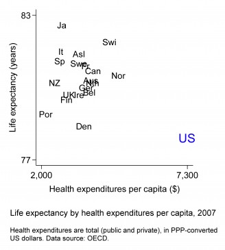
life expectancy versus per capita spend on health

This chart shows the change over time (incidently demolishing several arguments about American exceptionalism):
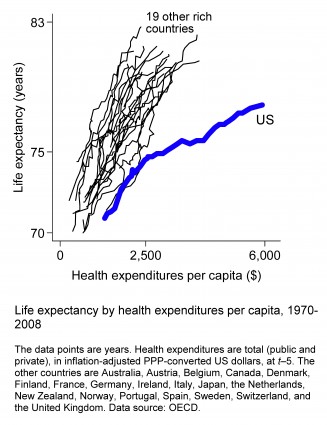
life expectancy and spending over time

Both charts from here. And it is worth reading the discussion (and the further commentary here on how good the charts are).

Given the general pattern in health statistics it should not be a surprise that US infant mortality is bettered by many other wealthy countries.

But you can check the statistics yourself interactively on Gapminder at www.gapminder.org and I would recommend looking at the plot of total health spending as % of GDP versus infant mortality (and look at the trends over time). But, don't take my word for this, go and look at the data.

0

You must log in to answer this question.

Not the answer you're looking for? Browse other questions tagged .