The data visualization choices made by the IPCC are poor and have the effect of obscuring the differences between model forecasts and observed temperatures.
Note: this answer assesses whether the IPCC have done a good job of presenting the comparison of observed temperatures and model projection. This, I think, is what a good skeptic would demand if the purpose of presenting the data is to assess whether the models have any predictive skill. This may not be the intention of the IPCC presentation, of course. Also, I am not assessing the IPCCs conclusions, merely their choices of presentation methods.
The key problem the IPCC or other climate modellers have to face is how to present the results of climate projections which contain a great deal of uncertainty. Models don't predict a single path of future temperatures: the short term climate is chaotic and, even if we know all the inputs with precision (which we don't) there are many factors that create many paths into the future. So even a single model will give an ensemble of possible paths into the future. So one key question is how to describe that uncertainty in a visual way that does not misrepresent the nature of the uncertainty.
Another problem is that there are multiple scenarios for what will happen in the future. The key ones use different assumptions about how the world will respond to climate change (will we constrain the output of CO2 or just keep producing increasing amounts each year?
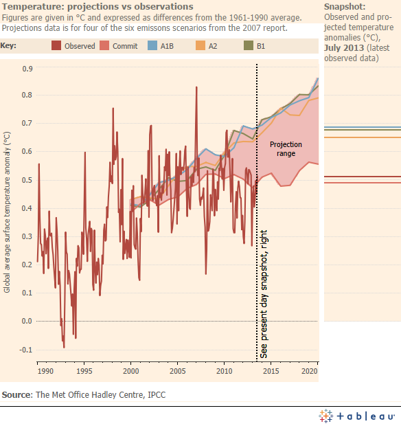
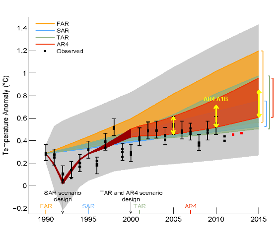
The initial IPCC chart does a half-assed job of the first problem and a poor job dealing with the second. The chart presents the envelopes of forecasts produced by particular models, which is commendable, but incomplete and it fails to account for the shape of the probability distribution of possible temperature paths (examples of better approaches below). The second problem is that the chart tries to show multiple envelopes from multiple model versions. This just confuses as the envelopes overlap and it is hard to get a clear visual impression of the particular envelope for any one model. In fact the choice of models to show is particularly confusing as the envelopes are shown for the key models from previous IPCC rounds despite the obsolescence of the old models and their irrelevance to whether current models are doing a good job. A better approach, if the goal would be to show one chart for each group of models showing the projections made at each previous report with a comparison of all subsequent actual observations. Small Multiples of this sort are a very effective visualisation technique (see this excellent discussion with many examples at Junk Charts). The IPCC even used this approach when they presented the original AR4 forecasts (why not, it seems reasonable to ask, just repeat these charts in the current report with observed temperatures overlayed?):

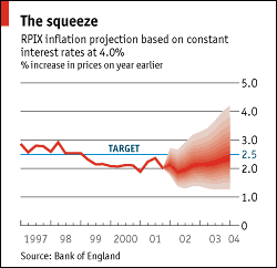
There are good techniques for unambiguously presenting statistical ranges on forecasts. One of the best is used by the Bank of England (BOE) for its inflation forecasts. Inflation forecasts have a lot in common with climate forecasts: they are based on complex models of the behaviour of the economy, projected from historic observations but containing chaotic noise. They, again like climate models, produce a range of possible paths for future inflation. An example is given below:

The economist article the chart is derived from also discusses the technique explaining it like this:
In 1996, the Bank introduced the innovation of presenting the forecast as a probability distribution, in order to highlight the risks to the central forecast. These forecasts, which are agreed by the Monetary Policy Committee (MPC), are called “fan” charts because the expected outcomes spread out in bands from the most likely path of inflation to cover 90% of the probability distribution.
The advantage of the BOE approach is that it gives the right visual impression that paths near the edge of the envelope are less probable than those in the middle. The IPCC envelopes in the original chart equally weight the whole envelope of forecasts giving the (incorrect) impression that edge paths are just as likely as central paths.
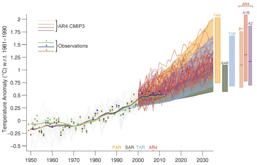
The final version of the IPCC charts compounds this problem by also adding many individual paths to the plot. Visually this overweights the extreme paths at the edge of the probability distribution far too heavily compared to the much larger number of paths near the middle of the distribution.
The final presentation also botches the second task even more thoroughly by including multiple AR4 scenarios despite the fact that only one of those comes close to representing the observations (such as CO2 emissions) which were uncertain at the time of the projection but are now history (why include scenarios assuming tight emission constraints when we know that didn't happen?)
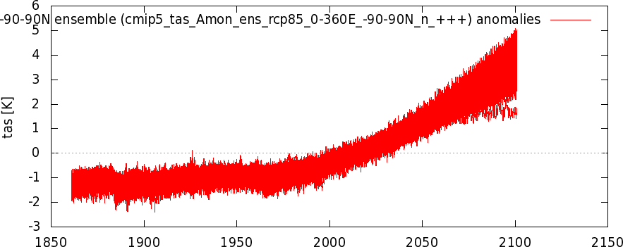
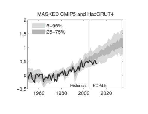
The IPCC could have done a much better job. For example, the chart below shows a much clearer view (I'm not judging the data here, just the presentation format):

This chart is from Judith Curry's blog but is initially derived from Jeff Hawkings here. Surprigingly, there have been very few, if any, attempts to either do this comparative analysis or to present the results well. As Judith Curry observes:
In the midst of substantial public interest on this issue, there is no published analysis that I know of that compares CMIP5 simulations to observations, although it looks like Ed Hawkins’ analysis is heading towards publication.
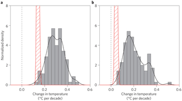
An alternative and simpler view would show a snapshot of the average performance of the models up to now versus the actual temperature record (this view simplifies the paths taken over time so loses some information). An example of such an analysis is shown below:

The original source for this is a recent paper in Nature (paywalled). The chart makes a direct comparisons among CMIP5 forecasts (the grey distribution) and the observed path of temperature since the forecasts were made. (Note this was published after the Curry comment quoted above).
Summary
The effective visualization of complex data is difficult. But good advice exists (for example: see the guru of the field Edward Tufte's work; the Junk Charts readable and topical blog; or the usually excellent examples at Flowingdata. Unfortunately this advice is mostly ignored, especially by scientists who often seem to believe "the data in the chart was fine; what's the problem?"
In pure visualization terms the IPCC's changes made an average chart much worse and obscured things a reasonable skeptic would have preferred to be clarified. The visualization changes made any comparison between model projections and observations much harder and much less statistically sound. In their defence, perhaps clarity was never their goal and they didn't have any competent visualization advice.
